
 By
By Reviewed by
In short
Useful therapist website examples make the service, location, payment arrangements and next step easier to understand. The twelve US practice sites below each offer a specific lesson, from visible fees to clearly separated services. We opened every linked page on September 26, 2026. These are editorial observations of public content, not measured rankings, endorsements of treatment, or audits of speed, accessibility and privacy. Use the examples to improve one part of your own website, then test the result with someone unfamiliar with your practice.
How were these therapist website examples chosen?
We looked for solo and small practice sites with identifiable US clinicians, a real service description and something concrete another practice could learn from.
The selection includes the Northeast, Midwest, South and West, with couples work, perinatal care, identity-affirming services, grief and health-related concerns.
It is a working collection, not a national league table.
Every linked page returned readable practice content during the check. We did not submit inquiry forms, impersonate clients or access private portals. A page resolving is different from every feature working. In particular, we did not benchmark loading speed or independently confirm each practitioner's claims about qualifications, insurance or outcomes.
The quoted phrases below belong to the linked practices and were checked September 26, 2026. The commentary explains the feature we would adapt. For the underlying page plan and privacy questions, start with the therapist website guide. Borrow the structure of a useful explanation, then write your own words and verify your own facts.
The September 26, 2026 review was text-based and says nothing about conversion performance. The home-page screenshots captured September 27, 2026 accompany that commentary; where an example links to an about or fees page, the text also discusses that separate page.
Borrowing a useful website pattern starts, for me, with naming the question it answers. A screenshot can show how a practice presents its fees or contact route, but it cannot tell me whether visitors became clients or whether copying the design would help a directory member.
1. Songbird Counseling Services: put practical information where readers need it
Songbird Counseling Services, a Seattle-based solo teletherapy practice, keeps its scope, Washington service area and payment explanation on a compact page with an unmistakable “Fees” label.

The copy moves from common reasons for seeking help to the logistics of contacting the clinician, so the reader does not have to switch between a biography and a separate sales page to understand the offer. Its explanation distinguishes paying the practice from seeking possible insurance reimbursement, a useful structure for any out-of-network page. Adapt that proximity of service, cost and contact information, while making your own account of fees and insurance no more definite than your actual arrangements allow.
2. Self Embrace Therapy: name the audience and the state
Self Embrace Therapy identifies Maureen Sharp's solo practice with the heading “Virtual Therapy in New York” and a clear focus on queer-affirming work.

The navigation separates the about page, services and FAQs, contact information and existing-client portal, which gives different visitors distinct paths without requiring them to understand the practice's internal workflow. A visible clinician photograph and first-person introduction make it clear whose voice the reader is hearing, while the repeated consultation invitation provides a recognizable next step. The useful lesson is to combine a specific audience with geographic clarity and a consistent invitation, rather than relying on welcoming adjectives alone to explain whom you serve.
3. Human Nurture Counseling: organize a niche around real stages
Human Nurture Counseling, Allison Morris's Denver practice, uses “new Parenthood” to name its central audience and separates prenatal, postpartum and related services in its menu.

That structure is useful because a person preparing for a baby may have different practical questions from someone already adjusting to parenthood, even when both belong within the same clinical specialty. The clinician introduction, portrait and Denver location give the service a human and geographic anchor, followed by a clearly labeled introduction-call route. Adapt the way one coherent specialty is divided into meaningful questions, while keeping language understandable for someone who has never heard a specialist term such as matrescence.
4. Dr. Chandler Puhy: distinguish therapy from assessment
Dr. Chandler Puhy's Atlanta practice leads with “Therapy, Testing & Evaluation,” making different appointment purposes visible before the visitor reaches the details.
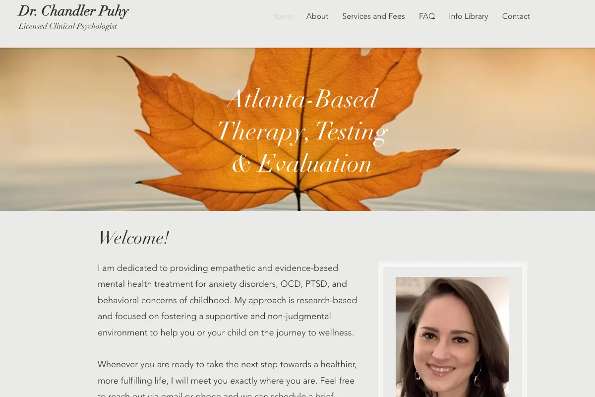
The main navigation includes services and fees, an FAQ, an information library and contact details, a compact architecture that other assessment practices can adapt without creating an oversized website.
A photograph and a short explanation of how to say the clinician's name add a personal introduction without displacing the practical information. The strongest transferable feature is the service distinction: parents or adult clients can begin by identifying the type of help they are seeking rather than guessing whether every appointment is ordinary weekly therapy.
5. Couples Counseling South Austin: explain the consultation itself
Couples Counseling South Austin's consultation and fees page uses the invitation “Let’s Meet” and then explains what the introductory conversation is for.
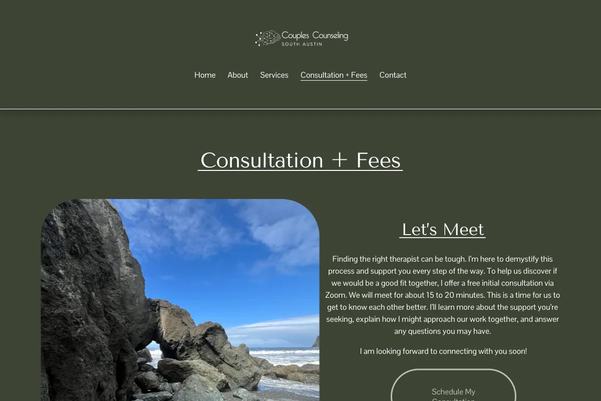
Jen Eversdyk's page distinguishes the ordinary individual and couple session formats and directs readers elsewhere for intensive-fee information, instead of presenting several unlike services as one generic hourly rate. The consultation button appears alongside the explanation, so a reader can understand what they are requesting before acting. Adapt that sequence by naming who attends, what is discussed and how a consultation differs from treatment, then place the accurate fee and insurance explanation within the same decision path.
6. Grace Therapy & Wellness: give a small group practice clear routes
Grace Therapy & Wellness in Austin uses “Book an Intake Call” as a concrete action and separates individual, relationship and other service areas on the homepage.

The page identifies real office locations and explains that insurance arrangements vary among clinicians, which is more useful to a visitor than assuming that every therapist in a group accepts the same plan. Its footer exposes good-faith-estimate and privacy links, keeping practical documents within reach after the service description. This is a structural example, not approval of every element on the page: do not copy displayed ratings or review features without independently checking the testimonial and advertising rules that apply to your profession.
7. Wave Break Therapy: show why the practice's background matters
Wave Break Therapy, a Boston-based practice presented through Kayla and Lauren, names its focus on parents facing a child's death or medical complexity and describes itself as an “exclusively web based” practice.
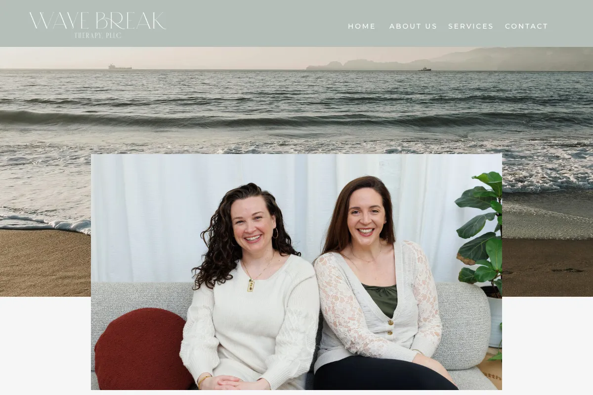
Its explanation connects the clinicians' hospital experience with the particular questions those parents may bring, rather than leaving that background as an unexplained employment history. The homepage also describes the appointment format and places contact information near the end of the account, allowing the reader to move from recognition to logistics. Adapt the connection between relevant experience and present service, while writing to the adult seeking support and avoiding promises about how grief should progress.
8. Alison Petok: make a specialized biography checkable
Alison Petok's about page presents a Boston-based solo social-work practice focused on cancer and chronic illness, with “Licensure” clearly separated from publications and training.
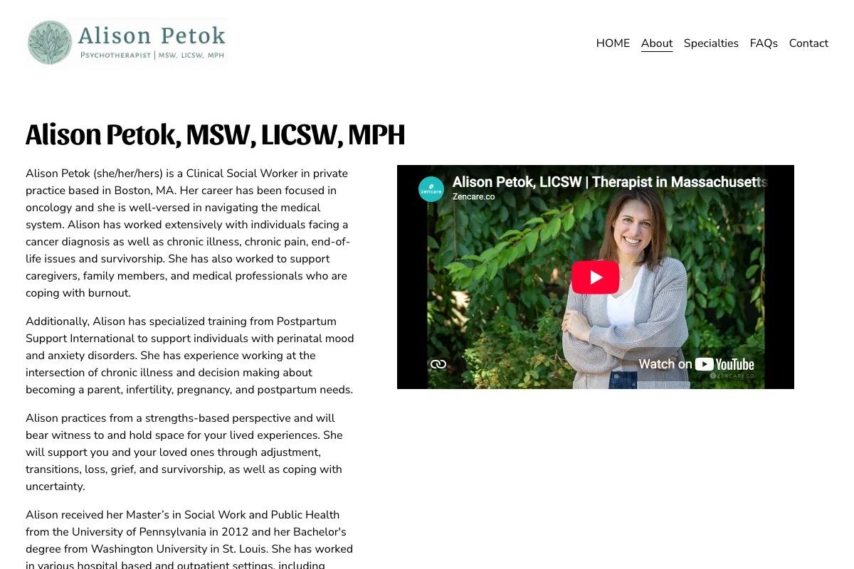
This arrangement lets a reader understand the clinical focus before reviewing the professional evidence behind it, and it keeps training history from becoming an uninterrupted wall of initials. The page also lists service states, working hours and a contact route, so the biography remains useful to someone deciding whether an appointment is practical. Adapt the clear distinctions between education, experience, training and license status, and avoid presenting completion of a short course as equivalent to a separate professional credential.
9. The Evergreen Initiative: separate clinical and organizational services
The Evergreen Initiative, Jack Bartel's Florida-based virtual practice, separates “Clinical Services” from education and consultation in its navigation.

That distinction gives an individual seeking care and an organization seeking training different starting points, while the service descriptions explain several specific reasons someone might contact the practice. The page places credentials after the service account and provides a route to rates, insurance and FAQs, making it a useful example of organizing several related offers under one professional identity. Disclosure: Bartel is also on Psychology.com's reviewer roster; his inclusion here concerns this visible site structure, and we have not independently audited the site's clinical, privacy or outcome claims.
10. Peter H. Addy: keep fees and professional services identifiable
Peter H. Addy's Portland practice website puts “Fees” in its information menu and gives professional supervision and education their own navigation area.

Its chronic-pain service is separately identifiable among the practice's other stated specialties, so a visitor can choose a more relevant explanation instead of reading every offering on the homepage. The visible consultation invitation provides a repeatable next step, although an individual practice should test whether its own visitors understand which service that invitation opens. Borrow the separation of public service information, payment information and professional offerings; inclusion here is not an evaluation or recommendation of psychedelic-related treatment, which requires its own clinical and legal assessment.
11. Tami Chelew: a short page can still establish who and where
Tami Chelew's Solana Beach practice website gives a concise location, license identification, areas-of-focus list and a direct instruction to “schedule an appointment” by phone.
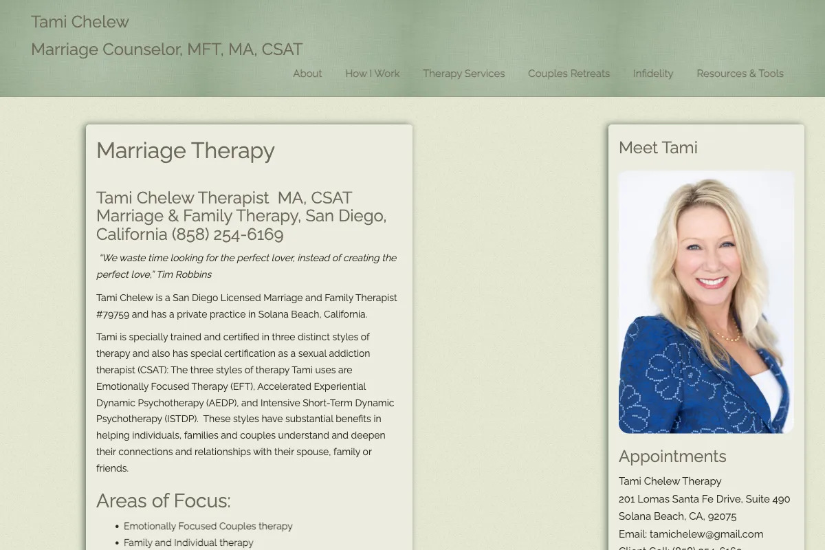
The page illustrates that a small solo site can communicate a recognizable service and contact route without a large collection of articles or elaborate interactive elements. It also makes the relationship-work focus visible rather than presenting every possible concern with identical emphasis. Adapt that directness, then add the fee, access and privacy information your own practice needs; brevity is useful only when it preserves the answers a prospective client requires to make an informed next step.
12. Grow Green Therapy: keep insurance and self-pay information distinct
Grow Green Therapy in Chicago groups payment information under “Insurance & Fees,” with separate descriptions of plan participation and out-of-pocket charges.
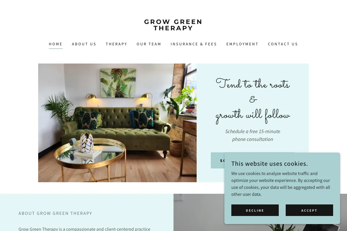
The page explains that a superbill supports a possible reimbursement request, which avoids presenting that document as automatic insurance payment. A consultation invitation, identifiable clinician and office location give the practical information a clear destination, while service descriptions provide context for the inquiry. Adapt the separation of plan participation, ordinary fees and reimbursement uncertainty, and consider whether hiring content on the same page should move to a separate route when it starts to compete with the prospective client's task.
Which patterns are worth borrowing?
The strongest shared lesson is specificity.
Each useful element answers a real question:
- Where does the clinician practice?
- Which appointment is being offered?
- What happens on a consultation?
- Where can a reader find payment details?
You can apply that lesson to a modest site without copying a practice's language, identity or photographs.
The second lesson is separation. Clinical services, professional consultation, existing-client portals and recruitment serve different audiences. Make the path for a new client easy to identify. If you maintain directory profiles too, keep the underlying service facts consistent; our Zencare vs Psychology Today comparison considers how profile presentation differs.
The third lesson is restraint in interpreting appearances. A readable page can still have a broken form, an inaccessible menu or an unsuitable tracking setup. We did not measure those properties here. Review privacy and accessibility independently before reproducing an embedded scheduler, analytics widget, video or contact form from an example site.
How can you turn these examples into a better website?
Choose one improvement this week: a clearly labeled fee page, a more specific service heading, or an explanation beside your inquiry button.
Put it into your marketing ideas for therapists work list and define what finished means. A small, verified change is easier to maintain than a complete redesign without a named problem.
If you also publish public posts, use social media marketing for therapists to keep the website destination and the public invitation consistent. A short post should lead to the relevant service explanation, not a homepage where the reader has to start the search again.
Check the finished site by asking these questions:
- Can a visitor identify the population, service and location?
- Can they find fees and the actual insurance arrangement?
- Does the next-step button explain what it requests?
- Are the clinician and relevant credentials identifiable?
- Do mobile, keyboard and form checks work on the finished site?
- Have you reviewed privacy and advertising obligations separately?
For sites discussing trauma or other crisis-related concerns, include a clear lower-page boundary: an inquiry form is not crisis support; in the US, call or text 988. The 988 Lifeline contact page verifies that support route. Return to the practice guides for the implementation task that follows your review.
When adapting these patterns to a listing, the TherapyDen comparison can help you distinguish your own website from a directory profile. Keep the same service facts accurate in both places.
